Simple Guidelines for Book Design
A few simple guidelines followed while designing a book will ensure that it is printed beautifully, in accordance with production standards.
Follow these 3 simple steps to help you design your book:
- Trim Zone
- Bleeding Images
- Image Selection
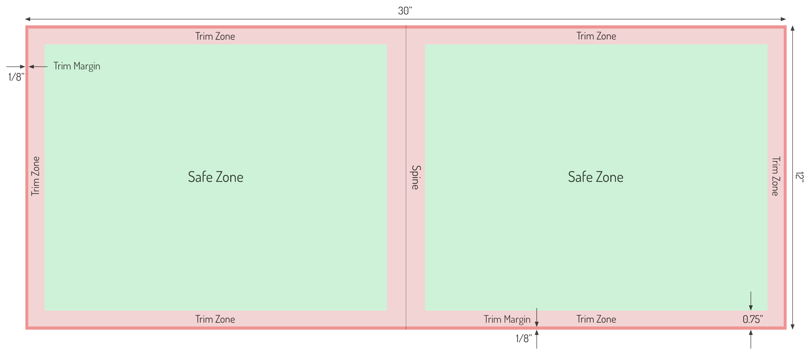
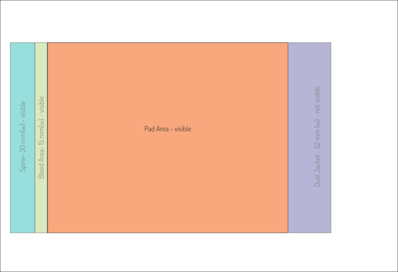
The Trim Zone is fixed at 0.75”. The Trim Margin at ⅛” is a part of the Trim Zone at the edge of the layout, which will get trimmed out during book production. The spine passes through the center of the layout and can be observed in Figure 1.
The spacing for Trim Zone and Trim Margin can usually be accounted in most of the popular book design softwares.
Bleeding Images
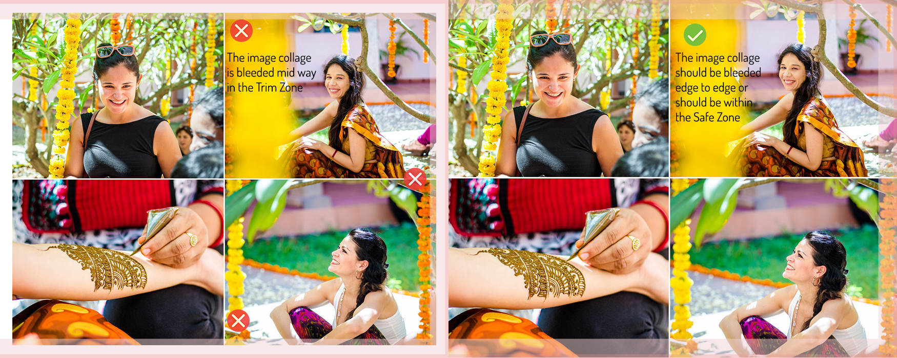
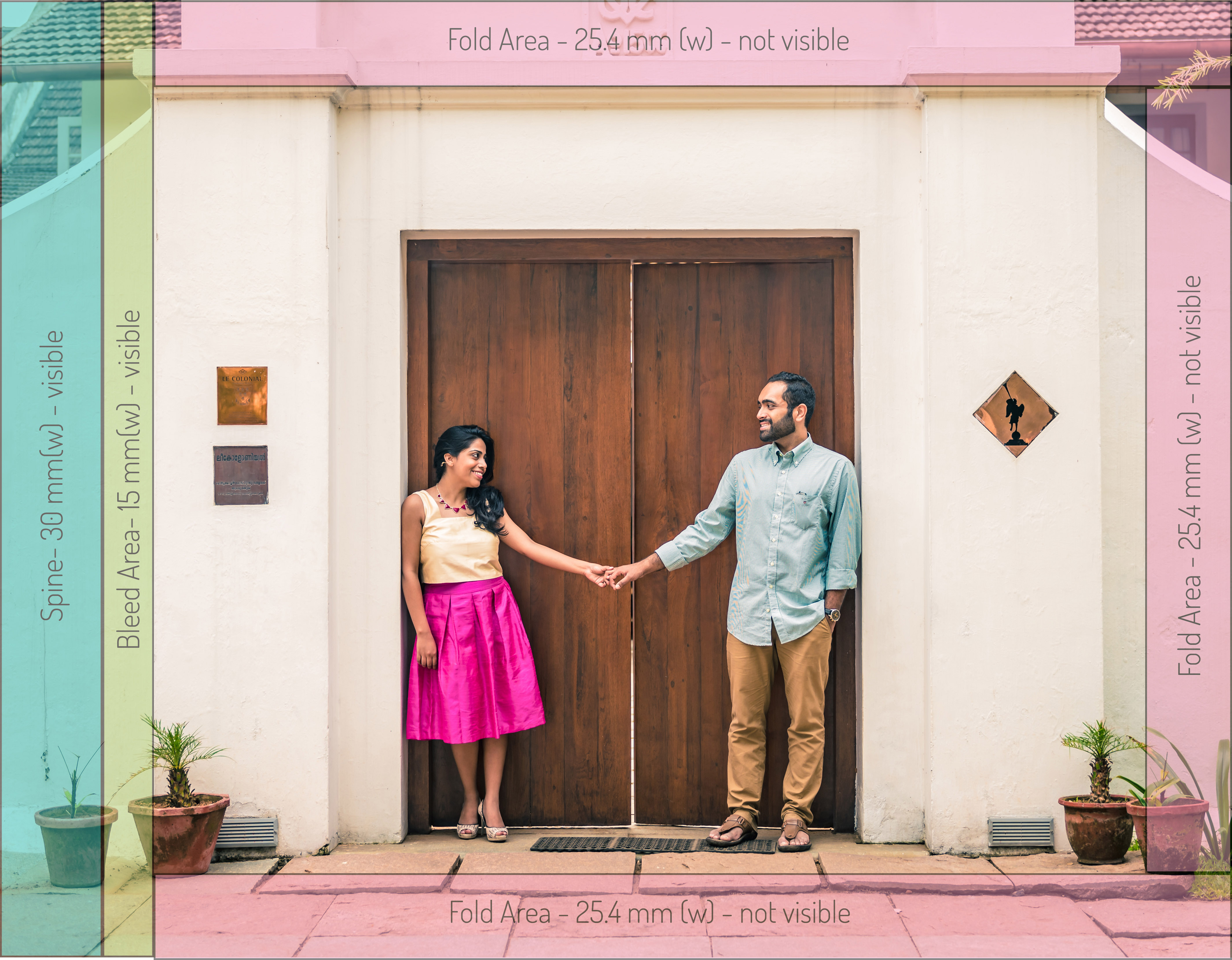
- Ensure that no critical part of the image is in the Trim Zone as shown in Figure 2.
Figure 2: Shows a simple design change to prevent trimming of critical image areas.
- The image is to be bleeded completely from edge to edge as shown in Figure 3.
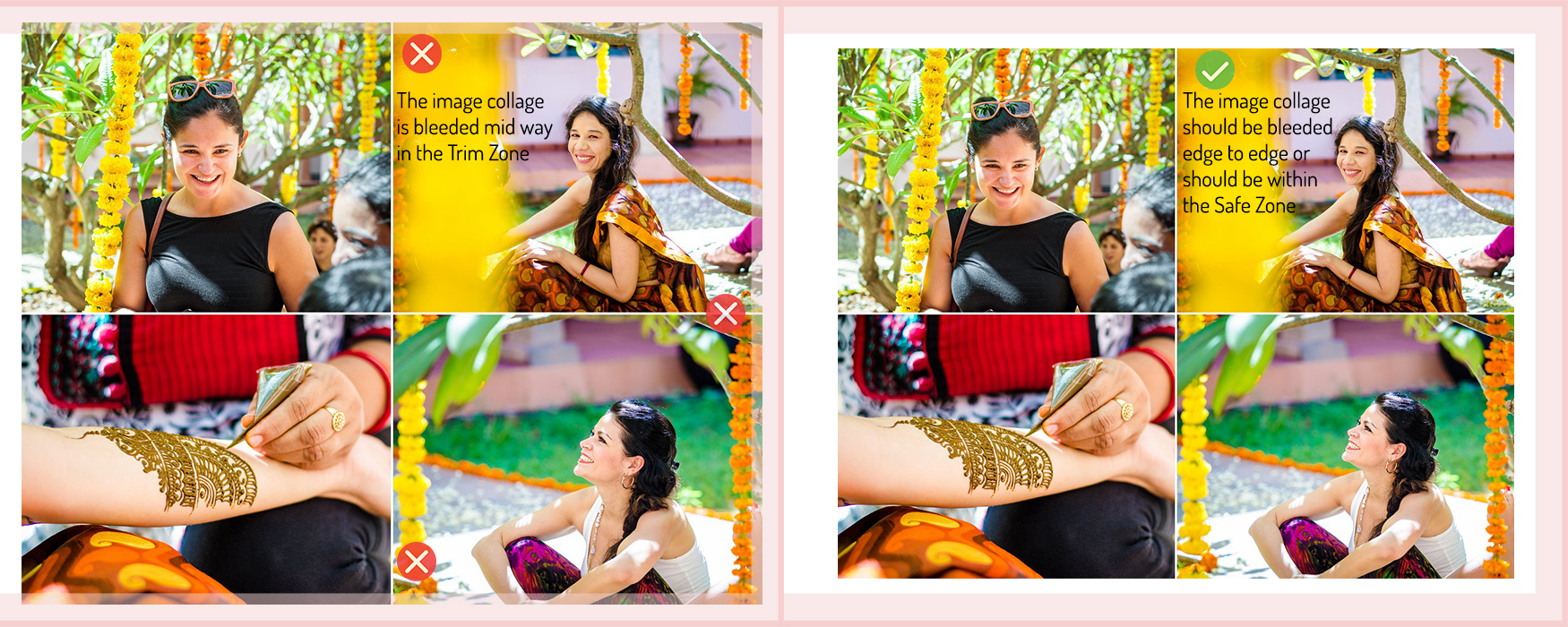
- An image collage has to bleed either from edge to edge or should be placed within the Safe Zone as shown in Figure 4 and 5 respectively.
Bleeding of Images across Spine
The Flushmount series of books are not subjected to this limitation as the entire layout is one continuous print. The spine in this case is just a scoring mark in the middle of the layout.
A few simple cases have been outlined below:
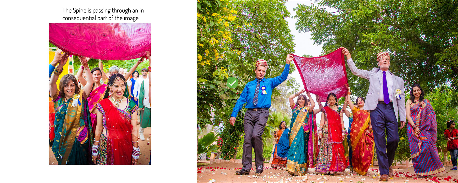
- Avoid passing the spine through a person or a person’s face as shown in Figure 6. Aim to design such that the spine passes through an inconsequential part of an image as shown in Figure 7.
Image Selection for Book Cover
Figure 13: Shows two image choices for the Book Cover with their Pros & Cons mentioned:

